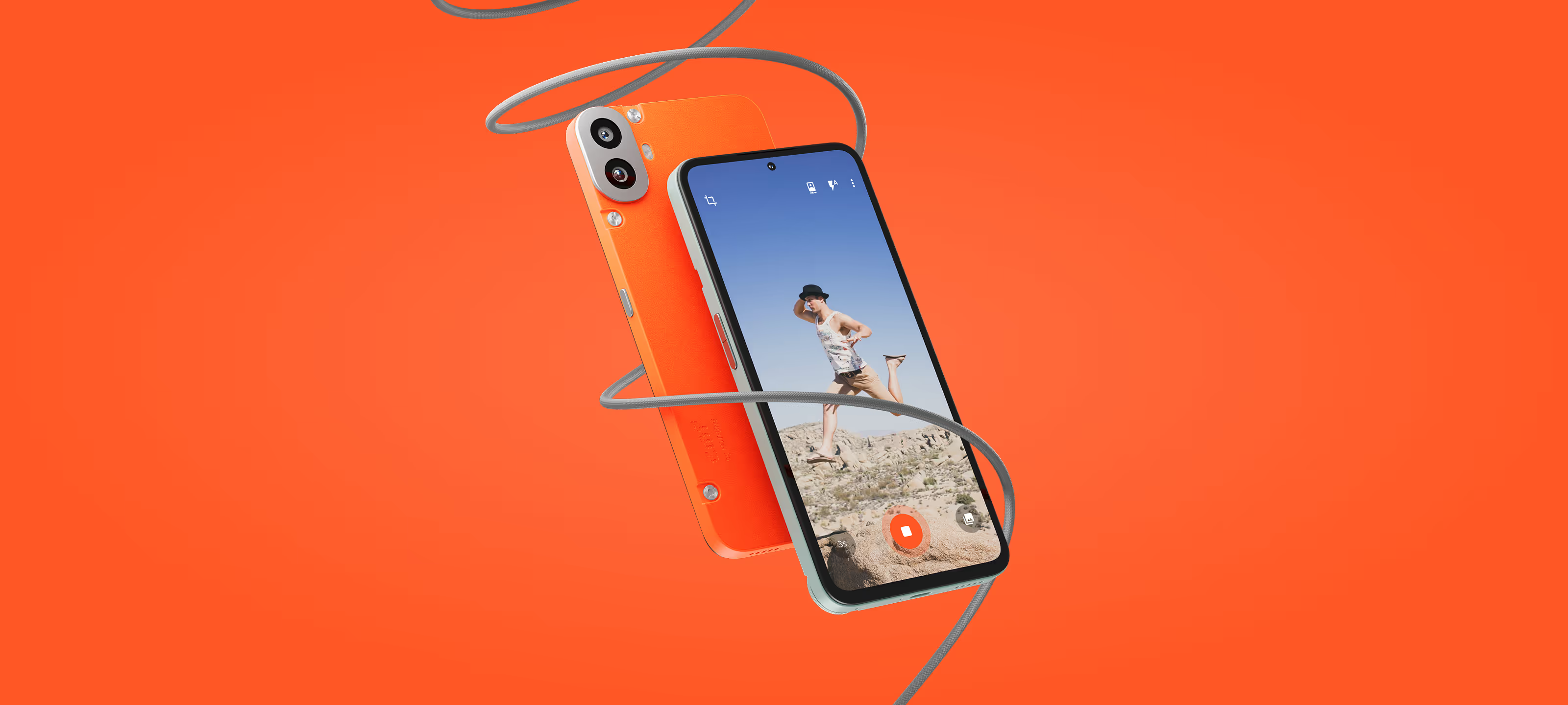
When I joined this project this was an existing app called Ghost Photo. Due to the name the app was being confused with apps that claim to take actual ghost photos, so it needed a new name and a redesign with the focus being on making it easy to set up the camera to take photos of you in set time intervals. Target audience for the app are young people leading an active lifestyle.
As the only designer on the project, I handled the complete visual redesign and rebrand of the app. I started by analyzing the existing app and it’s user flow, made UX improvements, and added an onboarding flow to the app. I ended up delivering a new and improved UI, an interactive prototype, a new logo, and an app icon.
After the redesign, confusion around the app's utility was gone, and when we did preference testing with the target audience, around 80% of them preferred the new color, showing that the rebrand moved the app in the right direction. The onboarding flow made it easier to start using the app, and it ended up getting over 10,000 downloads on the Play Store without any marketing.
Playposse
Santa Monica, CA, US
The idea behind the app is very simple - you pick an interval, set your phone down, press play and the app will keep taking photos as you pose in front of it. Even though it was simple, the old design wasn’t great and the name Ghost Photo left some people confused about the app’s intended purpose,
so we decided to proceed with the redesign.
The first step in the process was to audit the current app, map out the current flow, and look for potential UX and UI improvements. The onboarding, main camera screen and photo review flow were identified as key are that we should focus on during this redesign.

As this was a camera app, one obvious area that needed attention was camera controls, but because of its interval timer nature, it also needed an interval selector, onboarding that explains to users how the app works, and good photo management, as the users will be shooting a lot of photos.


To help the users start taking photos more easily we added a feature discovery flow that guides the user through each step of using the app.


When you are shooting a lot of photos, going through them to find keepers can become a challenge. The app tackles this in two ways: each time you start and stop shooting, a session will be created with all the photos that were shot in the series, and there is a photo review screen that makes it easier to select you favorites.


App is aimed at young people leading an active lifestyle, and orange was chosen to give the app a youthful and energetic feel. We tested it with the target audience and majority of them preferred it over the teal color the app previously used.
The last step of the rebrand was creating a new logo and app icon that would match the new UI and the app's overall look and feel. The logo was created using a script font in order to match the playful and youthful nature of the app and to appeal to its target audience.
When it comes to the app icon, I wanted to take a more minimalistic approach, but still have it convey what the app is about and match its vibe. For that reason, I used the app's bright orange color and created the app icon as a combination of a camera and a timer icon. Unfortunately, it went unused.
